 Making a comeback after a long hiatus, it’s my Indie Comic Review Segment! A lot has changed as you know: the ComicBookBoom Blog being no more, putting myself out there as a writer and working on my first full length issue. All this to say that another thing that’s changed is my perspective, especially when it comes to indie comics and the creators behind them. Back then I was wildly critical and unfair at times, having not taken the time to appreciate the astronomical effort required to write and produce a full fledged issue. When you’re indie…you are independent. As in, on your own island putting sweat, blood and tears into making these books. I cringe at most of my old reviews, having failed to give proper kudos to the creators. I’ll do better.
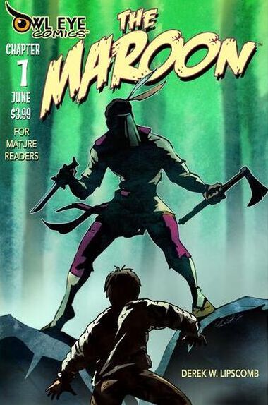
That being said...I’d like to give my first kudos to Derek W. Lipscomb for his enormously ambitious work, The Maroon. Not only has he generated multiple full length issues (14!), he’s done a majority of the work by himself. Writing and illustration, the bulk of work with any comic endeavor. He is supported by the editorial team of Brian & Rose Coles. I applaud Derek for maintaining this passion for a multiple issue run. Meanwhile, I’m sweating over the script of a single issue.
0 Comments
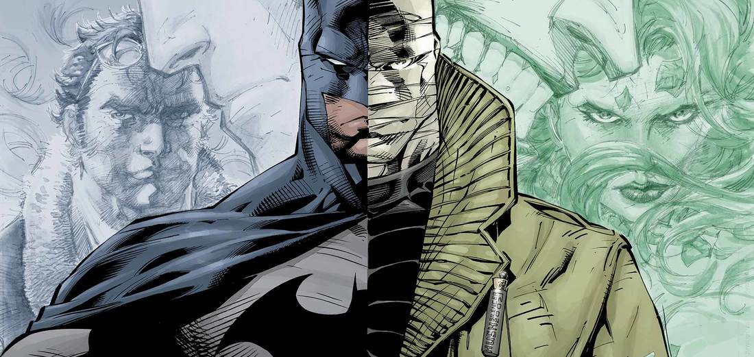 So what prompted the return of Comic Book Boom? It all started with Batman...everything Batman. I found my brothers old PS3 and he had Arkham City. I don't normally play video games because of my bad eyesight but Arkham City is a Free Roam game and damn I just love Batman and his villains. Next thing you know I'm sucked back into the thing that I truly love and missed. After completing the game (minus the dumb Riddler Trophies) a twitter follower recommended I read Batman: Hush. There was just one problem:
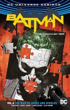 I am on a huge Batman kick right now. It's actually what got me back into blogging. Everything Batman. Movies, games and of course comics. I visited my local shop and was pleasantly surprised to learn about a comic book sale. They had dropped prices for just about everything for "tax refund day." It was then and there I decided to jump back in to the stream. I bought as many "Batman: Rebirth" issues as I could afford. (Rebirth is the most up-to-date run of Batman for those of you that didn't know). So here I am delving into the newest Batman, I started with the hardcover binding of Batman 25-32 which is called "The War of Jokes and Riddles."
After seemingly cranking through it in less than a week. (After just finishing Hush I wanted to see nothing but Bat/Cat Romance), I was fairly pleased with the current run and was glad that I dropped $50 on all the remaining issues...and I'm glad I started a pull list. It seems like Batman is in good hands, with the art looking fresh, crisp and on point. The stories capture the Batman tone, with a perfect blend of detective work, complex emotions tragedy and loony villainy. "The War of Jokes and Riddles" captured all of these (with one glaring flaw, more on that later).  Aw heck yeah, after a year’s hiatus I’m so excited to bring back Indie Comic Review. I love it when indie artist and writers approach me asking for reviews because I never know what I’m gonna get. It forces me to branch out and read something other than the conventional Big Two. And I was more than happy when Charles Stickney introduced me to the best reviewed coal mining, fantasy, horror, forbidden romance comic of 2017*. The art was grabbing so I decided to put on my hard hat and descend down White Ash’s mine. 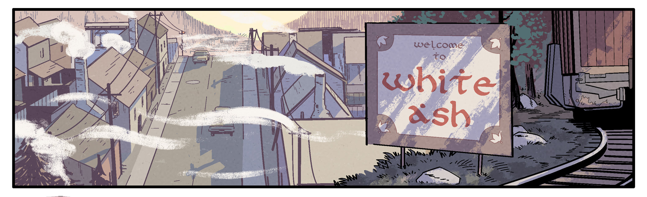 After a long hiatus from the blogging world I was sucked back into the mix thanks to a Twitter DM and an intriguing cover photo. A single iridescent rose reminiscent of that of a Sandman Cover had peaked my interest. Neil Gaiman’s Sandman is my favorite comic book series so I was suckered into it. One click lead to another and I learned about Chris Callahan and his book The Misplaced.
The Misplaced explores the story of a young man, James, who is discontent in the afterlife paradise that is Heaven. James feels incomplete in Heaven, for his wife’s spirit is not there. When confronted, an Angel of Heaven tells him they don’t know where she is, although James suspects she is lying. James seeks to leave Heaven so that he may find his lost wife. This story takes place in a Victorian-era time period on Earth. Awhile back, when I was just out of college, I started to clear out my room. I trashed a lot of stuff and sorted stuff for sale on LetGo, the nicer version of Craigslist. Now, I would never part with my precious comic collection, but I did have a large box of duplicates. (Also GI Joe and Transformers didn’t make the cut, come @ me). To my amazement, the first responses I got on the app were for my comics.
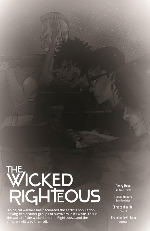
Fast forward and I’m in a parking lot parked across from an Orange Honda filled to the brim with comics. The guy had come with cash, but brought possible trades in order to offset the cost. 45 minutes later I had traded roughly 100 comics for…you guessed it…100 comics. In hindsight, the guy got away with a steal (more on that later). What were the comics? A near complete run of X-Men Comics from about the 1990 to the mid-90s. As I started to read, I was amazed with how far Marvel comics have come. I began reading issue #261 March 1990. I won’t bog you down with the details because I was lost myself. I landed right in the middle of a saga where the X-Men were dead but now coming back to life. Logan had a kid partner called Jubilee, Storm was a child and the team was scattered, with one team having a floating fortress over Manhattan. From what I’m seeing online, the consensus is that the 90s X-Men were really bad. This was a time when Marvel sought to profit from their multitude of titles and the “Comics Bubble” was starting to form. So as a result, dozens of X-men characters were being crammed into the universe and then divvied up amongst titles. Marvel would go bankrupt in 1996 and I was told that the stuff they were putting out just before then was garbage. I think part of the garbage was the complex interwoven storylines that were super confusing. I muddled through “regrouping phase” and into a “pitted against a prejudicial foreign nation exterminating mutants” saga. All the while I was frustrated with the fragmented storytelling and confusing references to fostering storylines. It was a time where if you didn’t buy all 3 to 5 different X-Men titles per month, you were screwed. There were just so many damn storylines I couldn’t take it. I enjoyed a random saga where the X-Men are in space resolving some galactic conflict where Professor X is being mind-controlled. Was there any groundwork for this story…no. So now I’m two years into this run, and I assumed I would be caught up. Yet there are still villains popping up out of nowhere occasionally and other bizarre fixtures. I’ve read 30+ issues and out of nowhere appears a demented omnipotent being who challenges bad guys to torture mutants. What the fuck is going on here? The writers act if I know who this being is, and that I should know where there baddies are coming from, and why they're playing this evil game. No answers. The worse part of this whole run is the terrible writing… It was as if every writer wanted to surpass Alan Moore. Except, instead of spinning an interesting tale, I was trying to power through pages and pages of crappy dramatic narrations. It’s seriously fascinating how much they crammed into one story. In X-Men #305, it was a double sized issue with page upon pages of dramatic Magneto monologues. That paired with the messy, confusing groundwork (“Where did THIS guy come from?!”) made this run a difficult read. …and the art. The art was ok at best, and a mess at worse. The artist, probably crunched with deadlines, would constantly draw “light scattering backgrounds” without any real regard for setting. No time to ink out a city backdrop? Just fill the page with laser beams! This tactic was used often. Almost zero use of quality inkers. No depth was created nor cool imagery. It was the complete opposite of The Killing Joke or Watchmen. If anyone was supposed to copy those guys it was the Marvel artists, not the writers. So Orange Honda guy duped me and got away with a steal. He got a bunch of Spider-man: Brand New Day and Invincible Iron Man issues. In terms of trade value, he probably doubled his dollar amount while I’m left with what I thought would’ve been a nice fun run of comics. The introduction of Bishop is the only bright spot of this whole run (Mr. Orange secretly withheld Issue #282, Bishop’s debut, from the trade…asshole). So what am I trying to say? Well, I spent the last few months chipping away at this stack of comics because I felt like I need to read these at least once. Do your research folks, if you see a long run of your favorite comic heroes, make sure to check the Net and see if it’s worth your while. Also, I’m so fucking tired of Forge. Seriously, he is the worst. Hopefully, I can move onto another better run of comics. If you got any recommendations, comment below. Till next time! -AJ 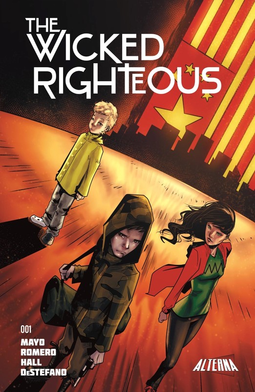 More and more I’m finding that time is a precious commodity for me. I just learned that in March, I will be working 22 days straight, no breaks. In between sobbing and working I managed to scrape together enough time to read and review issue #1 of The Wicked Righteous created by Terry Mayo and published by AlternaComics. The Wicked Righteous is a story where a biological attack kills everyone in the world with two exceptions: 1) All children and 2) anyone who has taken a life. Before we go any further, allow me a moment to reflect. First off this premise sounds eerily like Y the Last Man written by renowned comic book writer Brian K. Vaughan. In Y the Last Man, a biological attack kills anyone in the population with a Y chromosome (all men). This awesome series went on to win an Eisner award and is regarded areflects one of Vaughan’s best works. I pray that Terry Mayo has at least heard of the series and didn’t inadvertently knock off one of the best graphic novels in the last 15 years. Secondly, unlike the Y chromosome (something that connects all the deaths), The Wicked Righteous makes us swallow a huge pill. A biological attack that discerns age and criminal rap sheet? Please. 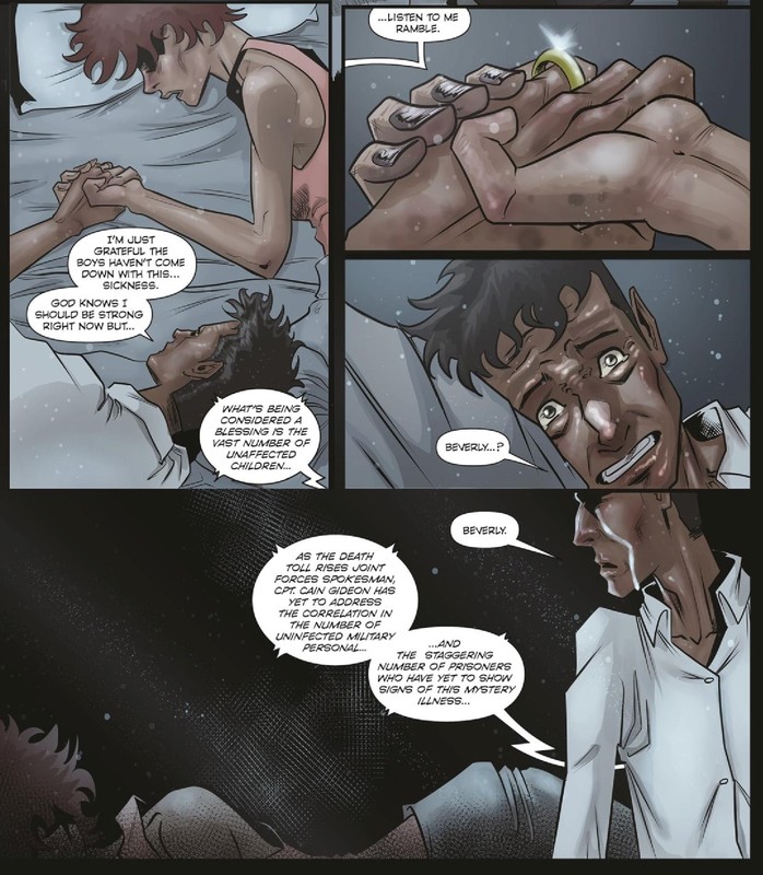 But wait…bear in mind, I only read the first issue, so perhaps there will be more to this attack then is initially let on. Mayo has introduced religion as a major theme. Perhaps, maybe God is at play instead of some advanced virus. If God is responsible then Mayo will set himself apart from Vaughn. If not…then I’d ask for a refund and Vaughn should get a royalty. I’m optimistic because the series summary ends with this line: This is the world of the Wicked and the Righteous…and the children will lead them all." Ok, back to the story. The Wicked Righteous follows four brothers (Johnny Matt, Lucas and Mark) as they begin their plans to vacate a dangerous San Diego. Their plans are interrupted when a girl is kidnapped by a ruthless gang and they decide to save her. The story also features a deranged kid left behind by Lucas that will no doubt pop up again in the coming books. The issue ends with a stressful cliffhanger. As I mentioned earlier, there is a religious element at play. Some Bible-based comics shove the message down your throat in hopes that you’ll go to church. This is not one of them and for that I commend Mayo. He goes a more subtle route utilizing the Bible as inspiration, that doesn’t come off as preachy. The four brothers had a religious upbringing and as a result of the attack, Lucas turns away from God and Matt is drawn closer to God. Also, if you hadn’t caught on, the brothers are named after Matthew, Mark, Luke and John, Gospels in the Bible. 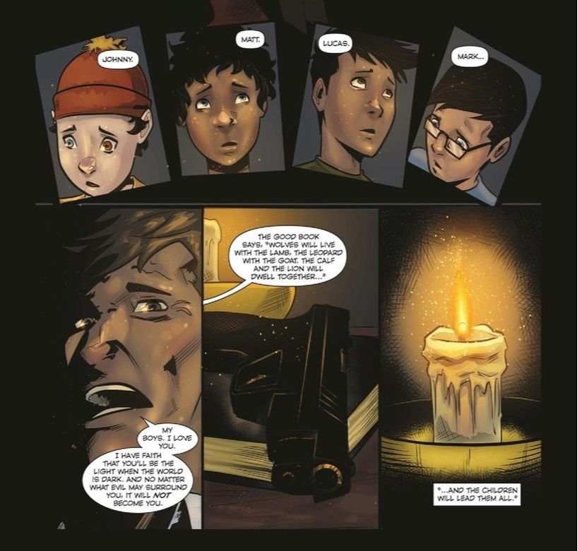 I need to stop reading just issue #1 for these reviews…because I want more. I’m going to make it a policy that I won’t review single issues, because frankly I wanted to know what happens next. That’s a good thing. The issue left off with a major cliffhanger, a protagonist in major peril. I wish Mayo had worked harder to make me invested in the characters. Unfortunately the brothers are pretty generic, offering very few quirks or unique character traits. I hope in the coming issues I start to root for the four brothers. But Mayo did do just enough to hook me. The art is a strength of this book. I must warn you, despite being about kids this M-Rated book is gory. Chris Hall did an excellent job of executing (pun intended) when it came to that gore. However, he uses the same gold color tone in the background throughout the entire issue, which gets boring after a while. The repetitive background really detracts from the rest of the art, which is quite good. Lucas Romero did a solid job with pencils and character creation. I also enjoyed his use of inks, creating great shadows setting the tone. The deadly gang members in the back half of the book are so unique and well done by the two artists. Just like the writing, my only wish is that they hadn’t made the brothers so generic looking. There is nothing special or differentiating about them. You won’t be seeing any “Matt/Mark/Lucas Cosplays” anytime soon. 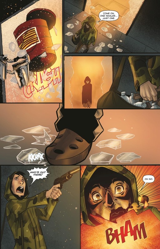 In conclusion…It’s difficult to give Mayo a score for his writing. I can’t tell if he’s knocking off Y the Last Man or if he’s going a totally unique direction. I thought our protagonists (the 4 brothers) were very boring while the rest of the supporting cast was super interesting. Despite my doubts, the final scenes have me intrigued for issue #2. The art was a strong point, I just hope that Chris Hall lays off the Midas Touch in the coming issues. If the Brothers start to develop as characters, I think we’re all in for an enjoyable read.
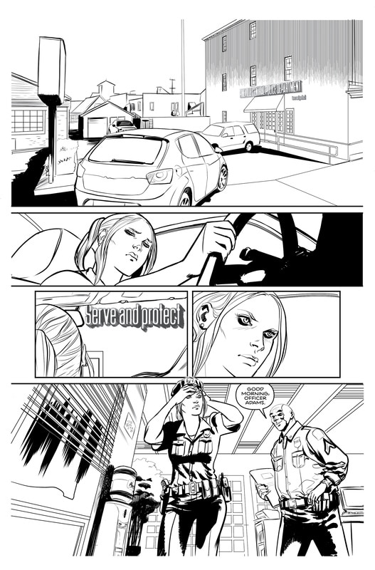
  Indie comics are often created from dreams. Every time I read the forward in an indie comic, I always see the same thing. The creator always wanted to make comics and decided one day to finally do it, take a chance. I commend these people, I really do. I’ve been trying to do it myself but I feel I’m constantly in a rut and I struggle to form my story. That’s why I commend Darryl Mansel for taking a chance and following through on his desire to make a story. Darryl managed to raise $4,600 dollars online and execute his goal. So let me be clear…I respect what Darryl has done. Doesn’t mean I like his story. Sadly, Pineville #1 did little to reel me in. The story introduced two plotlines (so far unconnected) and neither were especially grabbing. “But AJ, that was just the first issue, don’t be so quick to judge!” Actually, I am allowed to be quick to judge. Comics are a powerful storytelling medium that should suck people in on first sight. I feel more people would read comics if they saw past the “it’s childish” excuse and read the first few pages of a good book. Speaking of first few pages…Dennis O’Neil argued that when it comes to writing comics, you need to open the story with a hook. Something on the first two pages that immediately intrigues the reader. Without it, you’ll lose the readers perusing the comics rack. This isn’t one man’s opinion, it’s industry common knowledge. Pineville did not hook me from the get-go. In fact the story opened with a few prison shots and an inmate going through processing. The “hook” eventually comes on page 3, when our protagonist Cooper Fourney makes the bold claim that he’s going to kill every other prisoner. Holy crap, now that’s a hook! The problem is after that bold statement, Darryl completely ignores that intriguing juicy bit. Instead he opts to cram in as many prison story clichés into one issue. The warden is a hardass, these are the prison gangs, here’s a friend of mine that I did time with. The “kill everyone” line was so good, I just wish Darryl stuck with it just a little longer to generate interest. Instead, it just snapped back into an episode of Prison Break. 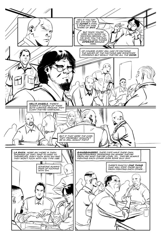 Our story then takes a sudden abrupt turn. I mean abrupt. One page we see skinheads and mob bosses and the next is some some good ole’ sexy times. Enter protagonist #2, a prostitute in the middle of her shift. That’s one way to hook someone, but not exactly merit worthy. We learn that Cassie is working to pay the bills and help care for her grandfather. So far the two protagonist don’t connect in seemingly any way, but perhaps that will change. The real hook comes on the very last page. It turns out Cassie is also a cop! Cop by day and hooker by night certainly makes a great “what if” story. So Darryl has the right idea, he just didn’t execute to perfection. He’s created two intriguing concepts: a hooker-cop and a (maybe) serial killer prisoner. It’s just unfortunate that the hook had to come from page 3 panel 5 (if you haven’t caught on, I’m pointing out how little the whole “kill everyone” thing was mentioned), and the last page. In the coming issues I’d like to see…less prison story clichés and nude scenes. I’m not being a prude, I’m saying Darryl wrote 3 pages of a sex scene and then a random (totally unnecessary) shower scene. Instead of devoting a whole page to her morning routine, maybe use those pages to contribute to the story or hint that she’s a cop. I would also like to see more into the psychosis of Cooper. Is he crazy or a man with a plan? 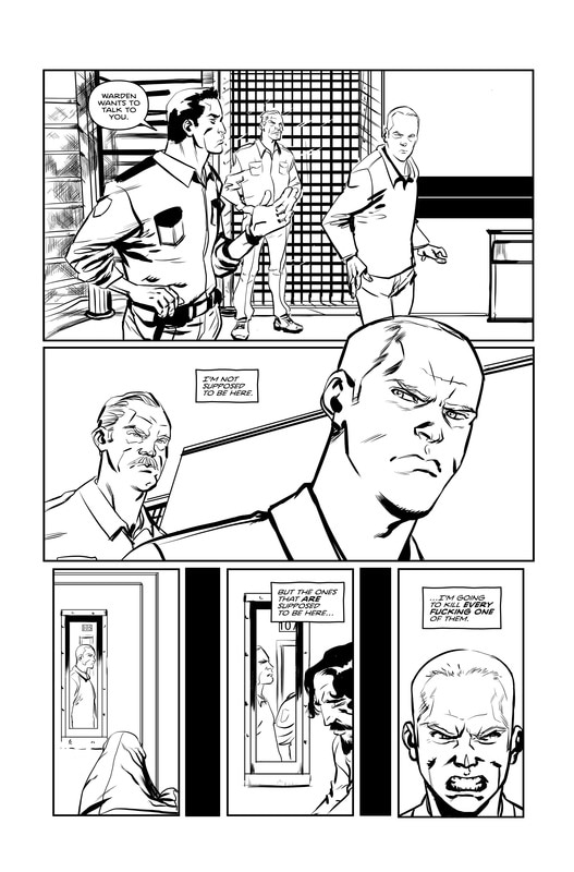 The fact that I’m asking these question means that I’m at least intrigued. He’s introduced some interesting premises worth reading. Although if I paid for the first issue I would be salty since a whole lot of nothing happened. I certainly hope in the coming issues Mansel gets to the point faster instead of filling up pages with boobs and prison gangs. Generate tension and suspense, or else the reader is lost. The art is super squeaky clean. The characters and setting is pretty sound. Very minimalist background. My one criticism is that Jordi Perez took almost no risk with inking. Hardly any crosshatching or shading. Pineville strikes me as sequential line art with various line weights. Because the line art is so black and white, it isn’t very dynamic. No depth has been created, hardly any texture. The prison looks pristine, not at all gritty. Because of the minimalist line art of Perez, it doesn’t make for a very interesting visual. I would have liked to seen color or at least an intricate grayscale (which I feel is necessary if you don’t color). In conclusion…Darryl Mansel’s Pineville presents some interesting premises and hooks but fumbles on delivery. The strengths of the story were overshadowed by prison clichés and sex scenes. The art is technically flawless but is pretty boring; Perez took no risks. The minimalist art paired with choice story telling doesn’t bode well for the book’s future. The story’s only hope of keeping readers hooked is to capitalize its strengths (killer prisoner, hooker cop) in Issue #2.
If you’re willing to see past a slow start, keep your eyes peeled for Pineville #2, which will be available on Comixology soon. If you can’t wait to read Pineville, check out Darryl’s Twitter Page and shoot him a DM. He’s a nice guy and might help you out.
 All images are used with permission from the author, Darryl Mansel. (c) 2017.
Pineville. (c) 2017 written by Darryl Mansel and art by Jordi Perez. All rights reserved. No unauthorized reproduction permitted. Any use of material contained within must be with the approval of copyright holder and/or publisher. For more information on Pineville visit https://www.indiegogo.com/projects/pineville-comics#/ . 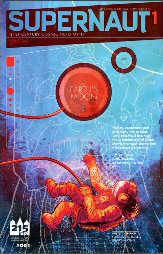 I must admit, my faith was wavering when it came to Indie Comics. Up to this point the comics I reviewed have ranged from disappointing to absolute waste of time. I’ve been harsh, but rightfully so. So, when Michael Nelsen dropped a press release into my inbox for his series Supernaut, I couldn’t help but feel pessimistic. I feared another bust. Boy was I wrong. Supernaut has to be the most refreshing comic series that I’ve read in a long time. Michael Nelsen began creating Supernaut in 2012, writing the story, creating all the artwork and lettering everything. It took him two years to chip away at this project and the end product is a beautiful work of art. The story calls upon ideas of metaphysics, theology, mythology and a lil’ bit of Joseph Campbell. One could compare it to the movie Interstellar but Supernaut still stands on its own. A quick synopsis: Our story, begins like any trans-dimensional, space and time altering story would: in the sorta-middle. We see now enlightened astronaut, Stephen Haddon, confront the manifestation of God to ask him not to unravel reality. God tells him to buzz off. Haddon aka Supernaut, bands together with other trans-dimensional heroes and thieves to collect magical artifacts that supposedly combined would take down God. The best thing about this series is without a doubt the art. If anyone ever says comics is not an art form, share with them Supernaut. I can’t express how thoroughly impressed I am with Michael Nelsen. Nelsen is a graphic designer so it’s no surprise that each and every page is carefully crafted to fit this mind-bending story. Nelsen’s experience as a graphic designer especially comes to light when it comes to color. Each and every page is an explosion of beautiful colors in an “order-within-chaos” kind of way. No space is left a blank white and nothing appears unnecessary. The story itself challenges perceptions of reality and dimensions and the art suits this mind bending story perfectly. 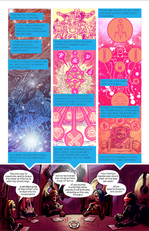 When I read this story I felt like I dropped acid.* Comics has always been about challenging the conventional with new and exciting ideas. I guarantee that this is some of the most unique artwork in the indie comics scene. The only thing I could possibly compare it to is Neil Gaiman’s reality bending Sandman, but even that comparison is a stretch. I feel that Supernaut’s art stands apart as a truly unique entity. Brilliant use of colors paired with unique graphics and sci-fi lettering of various varieties. As for the story, it perfectly pairs with Nelsen’s art style. The story originally was meant to be a Green Lantern-style story, because lord knows we need another one of those. Thankfully, Nelsen evolved the story into something so much more, a deep exploration into life, metaphysics and higher existence(s). You can tell he took the time to research the physics and theology behind what makes ups life. What is a soul? Are there parallel universes? Nelsen called upon literary quotes ranging from Albert Einstein to the Bhagavad Gita. At one point he references the Wow! Signal which is an actual thing. It’s no wonder it took him 2 years to make this series, the amount of work it must have taken to compile complicated ideas and translate them into equally complicated graphic works of art must be extremely time consuming. 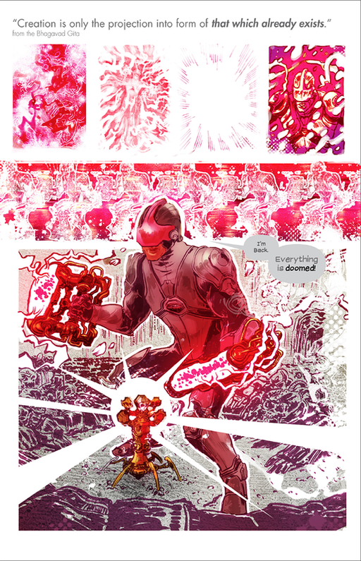 Despite the acid trip artwork and the complicated ideas, at its essence the story was fairly simple and accessible. The good guy needs to stop the bad guy and he needs to find certain things to stop said bad guy. The great thing about Nelsen however was that he told this in an entirely different way. Yes, the premise is a simple one, but the journey is one wild ride. Nelsen employs ideas about time and space and applied it to his story telling method. The entire first issue is literally told backwards. Literally. I applaud him for telling this story in such a unique way. The supporting cast might be my only negative I have to offer. Because there’s so much to cram into the story, you’re handed a brief profile of our supporting characters. This choice to introduce the characters by profile inhibited the story a bit. (I spent 5 minutes reading up about a “pheromone spy” only to learn that she gets a panel worth of action). However, with so much going on, it seemed like Nelsen’s best solution introducing the team of thieves. Perhaps he should’ve expanded his series to more than 5 issues? You will bombarded with a lot of science. A lot. I’m sure a lot of it is inspired by actual science, but at times it struck me as heavily padded dialogue and narration. Most of the time it would be fascinating, other times simply draining. “It stores coded information in its plasma substrate…and transmits by trans-space and quantum interference.” -Supernaut #3, about a room in a tower. Science fiction readers will love this text. Some comic book fans will appreciate Nelsen’s diligence to flavor text and the science, others won’t. Regular readers with gloss over it and enjoy the overall story. Despite how you feel about it (tell me below) I think it fits with the story but it’s a little too heavy. Comics has always been about challenging the conventional with new and exciting ideas. I guarantee that this is some of the most unique artwork in the indie comics scene. " Overall, Nelsen has restored my faith in Independent Comics. His two year project resulted in some of the most beautiful works of art ever to grace the indie scene. That paired with carefully researched science and savvy storytelling resulted in a successful miniseries. If you are a sci-fi lover or have an appreciation for graphic design and art I highly recommend this book. If you are a casual comic book reader, I still recommend this book. I eagerly await the conclusion! Ragnarok n’ Roll -AJ *The author of this blog has never taken acid and does not condone it. However, if you feel inclined to take acid, we recommend you read Supernaut instead.
 All images are used with permission from the author, Michael Nelsen. (c) 2016. Michael Nelsen, 215 Ink, 50 Foot Robot Studios.
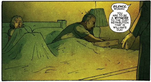
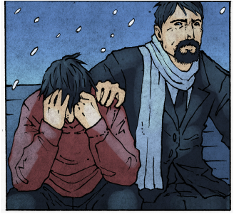
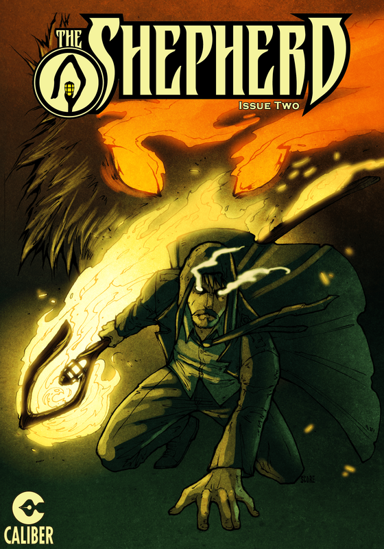 After my Indie Comic Review of Whatever Happened to the Archetype?!, I was approached by Andrea Lorenzo Molinari, the co-author of The Shepherd, a graphic novel exploring a broken, grieving father who enters the afterlife in search of his son, who died of overdose. Molinari asked me to review his book (co-authored with his son Roberto) and I happily agreed. I did warn Molinari that I would not write a fluff piece. Backscratching fluff pieces waste people’s time and money, especially if the book is bad. After my forewarning, Molinari essentially replied that art is subjective and that he learns from these reviews. He was ok with an honest review. First…a quick synopsis. Our story begins with Professor Lawrence Miller learning that his teenage son died of a drug overdose, meth to be exact. Lawrence, a theologian, slips into a deep depression, dwelling on the fact that he never connected with his son. His mind in a dark place, he decides to abandon his family and commit suicide to “find” his son (he was inspired by Latin classical literature). In The Seam, the land between reality and the afterlife, Lawrence sees his father and tells him he’s going after his son Val and the people responsible for his death. Quick note: How exactly he came to this conclusion that he could seek vengeance on drug dealers in the afterlife is never really explained. When you read this part of the story you’re left scratching you head. First he wants to find his son and now he wants to fight drug dealers, which he immediately assumed he could do now that he’s dead. We’ll just chalk this one up as "he’s gone mad." 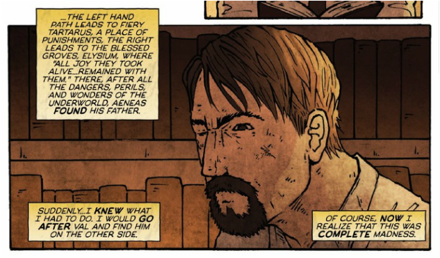 Lawrence attains a magic shepherd staff from his father that obliterates enemies’ minds with pure truth. He then begins to dwell in The Seam. After befriending a demon wolf, he hunts down and torments the drug dealers responsible for his son’s death. I thought he wanted to find his son…but again he’s kind of crazy. Now, on to the review. My initial impression was not a good one. In fact Issue #1 was not a great read. For starters, Molinari opened with this: 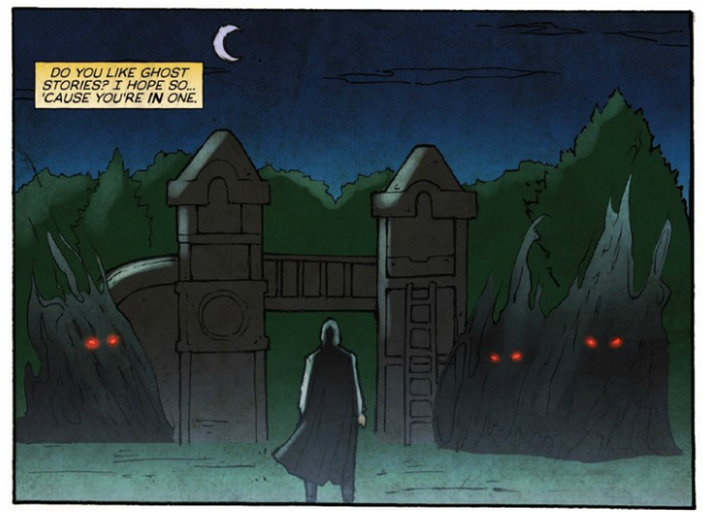 Pirates of the Caribbean (:20): This opening line just felt cliche in my opinion. And to boot, the art on the first few pages is…not great. You see, when creating comics, it’s always important to open with a hook. Writers and artists strive to hook you with the first two pages so you’ll go on and read the rest of the book. I was not hooked. I feel like Ryan Showers and Heather Breckel did not spend a lot of energy on these first few pages, instead resorting to blackened generic demons, with no finer details. They missed a huge opportunity to hook the reader. The art eventually finds its footing, but more on that later. What was worse, was the on-the-nose narrative provided by Molinari. He could’ve written the first two pages with almost no narrative and readers would be just as intrigued, if not more. So the opening was a bad start, missed opportunity. The remainder of Issue #1 was a lot of laying ground work and explaining motivations. Personally, I felt that it was slow moving but entirely necessary. Without Issue #1, you would be left more confused as to Lawrence’s motivations and madness. Like I said before, the first chapter concludes with Lawrence’s suicide and when he is dead, he decides now is the time he can hunt drug dealers. He also just assumes Val is missing (later confirmed by his dead dad). Why Val got lost in The Seam in the first place is never explained, even at the end of the book. So again some tough pills to swallow. The reader is left making several assumptions and large jumps to conclusions. I think Molinari made a few mistakes writing-wise.
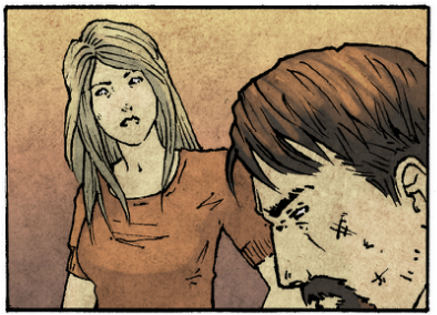
 3. The talking Demon Wolf’s lines were cringe worthy. Forgive me I honestly can’t explain it. Maybe you’ll like it, if you do comment below and tell me. 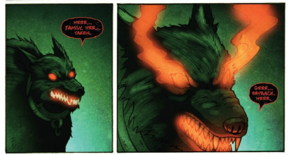 Now maybe I’m misinterpreting some things, if I am then Molinari didn’t do a great job explaining them. The purpose of a storyteller is to take the reader on a journey. Instead, it felt like I was limping along and trying to piece together what the heck was going on. Why wasn’t Lawrence looking for Val? Does he even have a plan? The story stabilizes after Issue #2. From there it was smooth sailing. Lawrence wants his revenge, is dwelling in darkness and the Staff is draining him. The book actually wrapped up fairly nicely. But I won’t spoil it. But I will say that the moral of the story comes to light, complex themes are resolved and there’s a heartfelt good ending. The final three issues was Molinari at his best and I applaud him for it. (He still doesn’t answer why Val got lost in The Seam, perhaps in Volume Two?) As for the Art…it got better. The opening sequence was super disappointing but the rest of the book found its footing. The glowing eyes and staff was really well done. There could’ve been more depth with the inking but I don’t think it hurt the art. The penciling style I felt was more unique then conventional comic artists. Heather Breckel did a fantastic job with coloring and creating textures both gritty and ethereal. Her coloring was the best thing about the book. Besides the opening pages, my only criticism is the duo’s inability to draw and color eyes. See Below.
“So wait AJ, are you telling me I shouldn’t read this book?” I know I'm being harsh on Mr. Molinari. I do think he touched on a compelling premise. A ghostly father enacting his revenge but then shepherding lost souls turned out to be a solid story. Sure there were a couple snags and a few conclusions need to be made but once you dive into the story, it’s not so bad. Elements of the story were well done. You felt Lawrence’s anguish and the moral of the story begins to appear as you read. I loved Lawrence when he was at his darkest, “justice-angel” state. The Staff of Truth is both a great weapon and device in the story. Pure truth resolving all conflict. Lawrence’s story is not the typical “blast the baddies and save the boy” story. In fact the ending is a departure from that, which was refreshing. Again, I won’t spoil it. All I can say is that it’s not what you expect but when you read it, it makes perfect sense and is a satisfying ending. 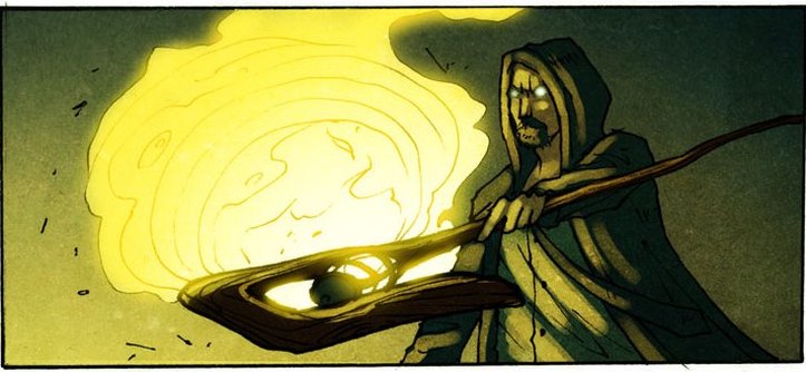 Speaking of Staff of Truth…I must be truthful. I’m torn, from what I read I can tell that Andrea and his son Roberto put a lot of work into this story. I just wished they had gone to an experienced editor to handle revision and execution. They need to bring someone onto the team to ask the right questions and offer constructive criticism. That way they can create a better flowing story. So do I recommend The Shepherd – Apokatastasis? Honestly I can’t say. I was fairly critical of the writing but the final three chapters rescued the story from collapse. If you find the story synopsis compelling and you’re willing to see past a few monologues and questionalble plot decisions…by all means read The Shepherd. It’s only $9 on Comixology. If you do read it. I want to hear you’re feedback. Was I too harsh? Or was I right? Let me know in the comment section below. I wish Andrea and Roberto best of luck with their future endevors and I thank them for letting me review their story. -AJ 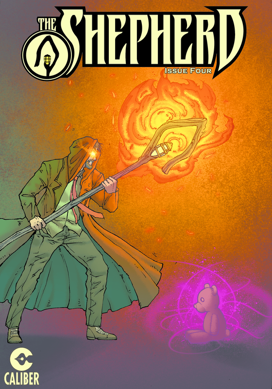 All images are used with permission from the author, Andrea Molinari. (c) Caliber Comics 2015. The Shepherd. Published by Caliber Comics 2015. (c) 2015 by Andrea Lorenzo Molinari and Roberto Xavier Molinari. All rights reserved. No unauthorized reproduction permitted. Any use of material contained within must be with the approval of copyright holder and/or publisher. For more information on The Shepherd, visit the website, www.calibercomics.com.
|
Follow My Social Media PagesCategories
All
Archives
July 2020
Formerly...
|
 RSS Feed
